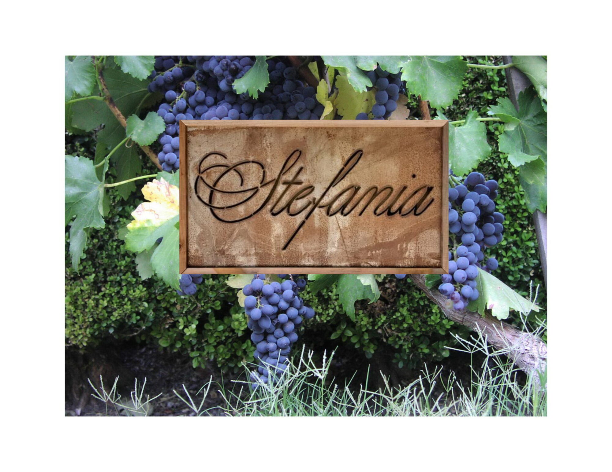
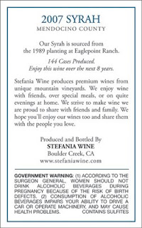
We’ve done a redesign again on our 2007 labels.
For the 2005 labels we were not happy with the artwork on the label. It captured just a portion of the water color painting and was missing the radar tower on Mount Uhmunum. That was something I really wanted on the label because I thought it was a distinct Santa Cruz Mountains sight.
For the 2006 wines we switched to a wrap around label that captured all of the original art work. Unfortunately it didn’t work well on the bottling line. It was prone to wrinkles and failures that required us to manually apply about 25% of the labels and made for a very unpleasant day of bottling.
For our 2007 wines we think we’ve finally got everything together. The artwork was condensed. The scale is not perfect, but we got both Mount Madonna and Mount Uhmunum on the label. On the first bottling of the year things went perfectly with no issues at all. I shortened the ‘romance’ on the back label to just a short bit about the vineyard location, drinking windows and the case count.
There’s one typo on this version of the label that we corrected before going to print, otherwise this is what you’ll see in our 2009 releases.


